
Before you even touch a landing page builder, you need a plan. It’s tempting to jump straight into designing, but the most successful landing pages are built on a solid strategic foundation first. Think of it like building a house—you wouldn't start hammering without a blueprint.
So, what does that blueprint look like? It all comes down to guiding a visitor toward one specific action. Everything else is just noise.
Your Foundation for a High-Converting Landing Page

A page that pulls in leads or sales isn't just a pretty design; it’s a purpose-built tool designed to do one job really, really well. Getting this part right makes every other step—from writing copy to choosing colors—infinitely easier.
The very first thing you need to do is define your page's single core objective. Seriously, just one. What is the single most important thing you want someone to do when they land on this page?
- Generate Leads: Are you trying to get people to sign up for your newsletter or download a free guide?
- Drive Sales: Is the goal to sell a specific product, especially a limited-time offer?
- Book Demos: Do you need potential clients to schedule a call or a product demo with your team?
Once you have that one goal, everything on the page—every word, every image, every button—must support it. If an element doesn't help push the visitor toward that action, it's a distraction and needs to go.
Understand Your Audience Deeply
Knowing what you want them to do is only half the battle. You also have to know who you're talking to. What keeps them up at night? What words do they use to describe their biggest problems? Generic marketing talk gets ignored, but copy that speaks directly to a visitor’s pain points gets results.
Spend some time digging through customer emails, online forums, or social media groups where your ideal customers hang out. Listen to how they talk. You want your landing page to feel like it’s reading their mind.
A truly effective landing page speaks directly to a visitor's needs and fears. Research shows that addressing buyer fears can boost conversions by up to 80%, while featuring human faces can grab attention and increase trust.
As you’re mapping things out, you might also consider how people will find your page. For example, QR code landing pages are a fantastic way to connect your offline marketing—like a flyer or a business card—directly to a targeted online experience.
Analyze the Competitive Landscape
Finally, do a little homework on your competitors. See what they’re up to. The goal here isn’t to copy them, but to spot opportunities. How are they positioning their offers? What are they missing? This helps you find a unique angle that makes your offer stand out.
This planning stage is also the perfect time to think about testing the waters. In fact, you can use a simple landing page to validate an idea before you pour tons of time and money into a full-blown project.
Don't forget the power of personalization, either. Studies show that personalized calls-to-action convert 202% better than generic ones. It's small tweaks like this, discovered during planning, that separate a good landing page from a great one.
To make this crystal clear, here’s a quick checklist to run through before you start building. Answering these questions now will save you a ton of headaches later.
Essential Landing Page Planning Checklist
| Planning Element | Key Question to Answer | Example for a Freelance Designer |
|---|---|---|
| Primary Goal | What is the single action I want visitors to take? | To get potential clients to book a 15-minute discovery call. |
| Target Audience | Who am I speaking to? What is their main problem? | Small business owners who need a professional website but are overwhelmed by the process. |
| Core Offer | What am I offering in exchange for their action? | A free, no-obligation consultation to discuss their website needs. |
| Unique Value | Why should they choose me over anyone else? | I specialize in fast, affordable websites for service-based businesses in just 2 weeks. |
| Key Message | What is the one big idea I need to communicate? | "Get a stunning, professional website without the stress or high cost." |
| Traffic Source | How will people find this page? | Instagram bio link, local business networking groups, and paid social ads. |
By building this strategic roadmap first, every decision you make from here on out becomes simpler, clearer, and far more effective.
Designing for Clarity and Persuasion
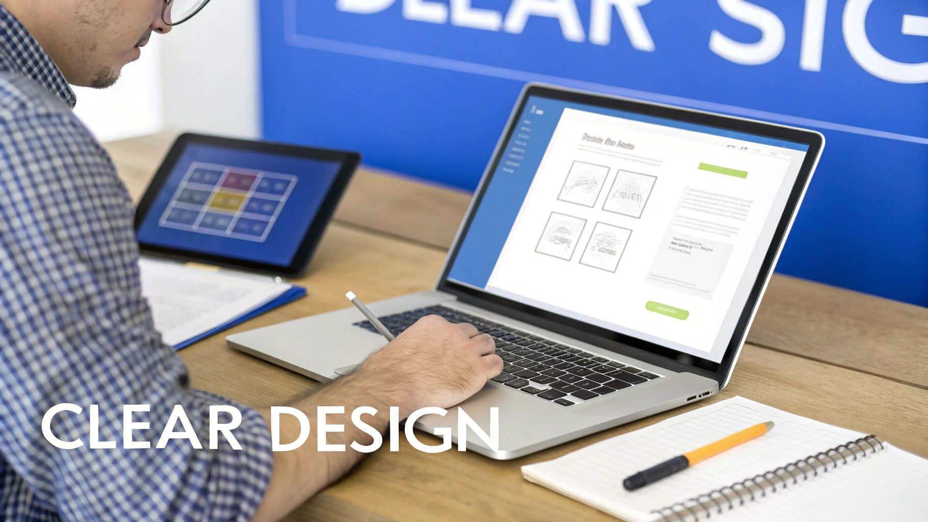
Now that you've got your strategy locked down, it’s time to bring it to life visually. Great landing page design isn’t about winning art awards with flashy graphics. It's about creating a visual experience so clear that your offer is impossible to misunderstand and your call-to-action is impossible to miss.
Your main job here is to create a clean, focused layout that strips away every single distraction. Anything that doesn't directly serve your page's one goal has to go. Think of it as paving a direct, uncluttered path for your visitor, with no tempting side roads.
Establish a Strong Visual Hierarchy
A good visual hierarchy acts like a tour guide for your visitor's eyes, telling them exactly where to look first. The most critical pieces—your headline, the CTA button, and your key benefits—should grab attention immediately.
You can pull this off with a few straightforward techniques:
- Size and Scale: Your headline should be the biggest thing on the page. Simple as that. Your CTA button also needs to be big enough to be noticed right away.
- Color and Contrast: Make your CTA button pop. A bright color that contrasts with the background is the oldest trick in the book because it works. It draws the eye right where you want it to go.
- Whitespace: Don't be afraid of empty space. Giving your elements room to breathe makes the entire page feel calmer and helps visitors focus on what really matters.
Getting this right means your visitor understands the core message in seconds, which is often all the time you get. The right visual cues can be the difference between a bounce and a conversion.
Choose Compelling and Relevant Visuals
Images and videos aren't just there to look pretty; they're heavy lifters when it comes to communication. A cheesy, generic stock photo can instantly devalue your offer, but a high-quality, relevant visual can forge an immediate emotional connection.
Your visuals need to back up your words. If you're selling software, show a clean screenshot of the product in action. Promoting a service? Use photos of actual, happy clients. Video is even better—a quick demo or a customer testimonial can build trust and explain your value much faster than a wall of text ever could.
Your design must be relentlessly focused on the user's journey. Remove the main website navigation, footer links, and anything else that might pull them away from the primary goal. Simply removing the navigation menu can boost conversions by as much as 100%.
Prioritize a Mobile-First Experience
This isn't just a suggestion anymore; it’s the standard. A huge chunk of your traffic will come from smartphones, and a landing page that’s a nightmare to use on a small screen will bleed conversions.
Adopting a mobile-first mindset means you design for the phone first, then adapt that layout for tablets and desktops. This approach forces you to be ruthless about what's truly essential, leading to a much cleaner and more effective experience for everyone. The data backs this up, too. Dynamic, mobile-responsive landing pages convert 25.2% more often than static ones. You can dig deeper into how responsiveness impacts conversions on amraandelma.com.
By focusing on a crystal-clear message, persuasive visuals, and a flawless mobile experience, you’ll turn that strategic plan into a design that actively works to get you results.
Writing Copy and CTAs That Drive Action

Okay, you’ve got a sharp-looking design. Now it's time to give it a voice. Your copy is what does the heavy lifting—it’s the persuasive engine that turns a casual visitor into a new customer, subscriber, or lead.
This all starts with your headline. Honestly, if you don't nail the headline, nothing else matters. You have maybe three seconds to convince someone not to hit the back button. A great headline doesn't just state what you're offering; it sells the outcome.
Think about it. "High-Quality Project Management Software" is a snooze-fest. But something like, "Finish Projects on Time, Every Time—Without the Chaos"? That hits a nerve. The first one is a description; the second one is a direct solution to a real, painful problem.
Crafting Copy That Connects
With their attention grabbed, your body copy has to deliver on the headline's promise. The secret here is empathy. You have to get inside your visitor's head and show them you understand their world. Address their pain points directly, then present your offer as the logical, obvious fix they've been hoping for.
Keep your language simple and direct. Ditch the corporate jargon and buzzwords; nobody is impressed. You’re aiming for a conversation, not a boardroom presentation.
Here are a few things I always keep in mind:
- Benefits Over Features: A "12MP sensor" is a feature. "Capture stunning, crystal-clear photos that wow your friends" is a benefit. Always sell the benefit.
- Write Like They Talk: Use the same language your ideal customer would use. If you can echo their thoughts back to them, you’ve won half the battle.
- Weave in Social Proof: Nothing builds trust faster than seeing other people have already taken the leap and succeeded. Sprinkle in testimonials, short quotes, or case study highlights.
Your goal is for a visitor to read your copy and think, "Finally, someone gets it." Your words should build a bridge from their problem to your solution, making the decision to act feel both easy and smart.
The Irresistible Call to Action
Now for the moment of truth: the Call-to-Action (CTA). This is where you ask for the conversion, and it's shocking how many landing pages fumble here with a weak, generic button like "Submit." That’s a massive missed opportunity.
Your CTA needs to be specific, clear, and packed with value. The button copy should be action-oriented and finish the sentence, "I want to..." For example, "I want to Get My Free Guide" or "I want to Start My 14-Day Trial." This small psychological trick frames the action from their point of view, making it far more compelling.
Just moving from a generic CTA to a benefit-driven one can make a huge difference in your conversion rates. Here’s a quick look at how to level up your button copy.
CTA Copy Comparison From Weak to Strong
| Goal | Weak CTA | Strong CTA | Why It Works |
|---|---|---|---|
| Webinar Signup | Register | Save My Spot | "Save My Spot" creates a sense of ownership and urgency. |
| eBook Download | Download | Get My Free eBook Now | "Get My Free eBook" is specific, highlights the value (it's free), and feels personal. |
| SaaS Trial | Start Free Trial | Start My 14-Day Trial | "14-Day" sets a clear expectation and removes uncertainty. |
| Consultation | Submit | Schedule My Free Demo | "Schedule My Free Demo" is a low-commitment action with a clear outcome. |
As you can see, the strong examples are specific and user-focused. They tell the visitor exactly what they're getting and why it matters.
Beyond the words, your CTA button needs to stand out visually. Use a color that contrasts with the rest of the page so it's impossible to miss. And don't just stick it at the bottom—place it above the fold and repeat it after key sections.
If you’re looking for more great ideas, check out these best call to action examples for some solid inspiration. Get the copy and the CTA right, and you'll have a landing page that doesn't just look good, but actually works.
Building Your Landing Page Without Code
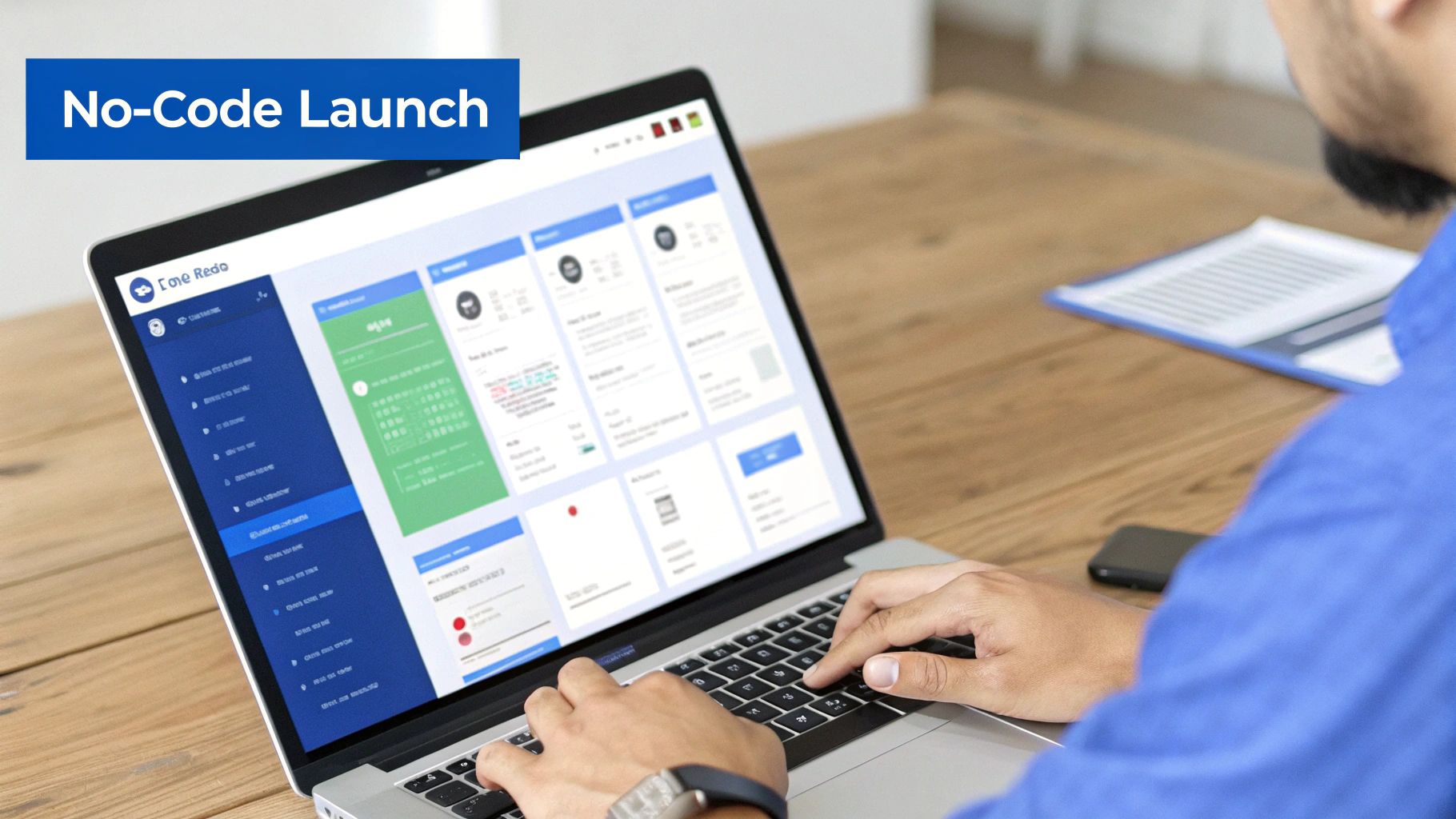
Alright, your strategy is locked in, the design is polished, and the copy is ready to convert. Now for the fun part: actually building the thing. Years ago, this was the point where you’d hand everything over to a developer and wait. But today, with no-code platforms like Hostmora, you can go from concept to a live page in literally minutes.
The real magic of these tools is their simplicity. Most offer a visual, drag-and-drop editor, letting you piece together text blocks, images, and forms just like you’re building a slide deck. No HTML or CSS required.
But what if you've already designed your page or found a template you love? Even better. Many platforms let you just upload a ZIP file with all your assets—the HTML, CSS, and images. The system takes it from there, instantly turning your files into a live, functioning website.
From File Upload to Live Page
Modern publishing platforms are built to cut out all the tedious technical steps. As soon as you upload your files, a whole chain of optimizations kicks off automatically in the background.
This means you get to skip the headaches of:
- SSL Certificates: Security is built-in. Your page automatically gets that little padlock icon, telling visitors their connection is secure.
- Global Delivery: Your page is instantly pushed to a global network (a CDN), so it loads lightning-fast for people in London, Tokyo, or San Francisco.
- Asset Optimization: Images get compressed, and code gets minified for maximum speed, all without you having to do a thing.
This isn’t just about convenience; it’s about performance. We know that page speed is a massive conversion factor. According to research, for every extra second a page takes to load, you can lose 7% of conversions. With bounce rates always looming, a fast page isn't a luxury—it's essential for keeping people from clicking away. You can discover more insights about landing page performance on genesysgrowth.com.
Adding Professional Touches Quickly
With your core page live, adding the features that make it feel polished and professional is usually just a few clicks away in your dashboard.
The whole point of a no-code tool is to accelerate your time-to-market. It lets you pour your energy into the message and the offer—the things that actually drive conversions—not server configurations or deployment scripts.
A custom domain is non-negotiable for brand credibility. It’s the difference between a clunky, platform-generated URL and a professional yourbrand.com address that builds instant trust.
From there, you can easily layer on other useful features. Need to gate content for a specific audience? Add password protection. Want to link to your page from a flyer or business card? Generate a QR code in seconds. To see this in action, check out our guide on how to make a simple website without any code.
You're so close to the finish line. The design is done, the copy is written, and the page is built. But before you smash that publish button, hold on. A final, meticulous quality check is the last line of defense between you and a launch full of easily avoidable (and conversion-killing) mistakes.
This last pass isn't just about catching a stray typo. It’s about putting yourself in your visitor's shoes and making sure their experience is absolutely seamless. This is your chance to find those broken links, spot a clunky mobile layout, or discover a form that goes nowhere. Think of it as the final dress rehearsal before the curtain goes up.
Your Pre-Launch Quality Checklist
Test Across Every Device and Browser Imaginable
I get it. The page looks pixel-perfect on your 27-inch monitor in Chrome. But what about on an iPhone running Safari? Or a Samsung tablet using Firefox? In today's world, cross-device and cross-browser compatibility isn't a "nice-to-have"; it's everything.
Grab your phone, your tablet, and maybe borrow a colleague's for a few minutes. Check the page on as many real devices as you can.
Here’s what I always look for:
- Layout and Alignment: Are all the elements where they should be? Anything overlapping, broken, or awkwardly stacked on smaller screens is an immediate red flag.
- Image Rendering: Do the images load crisp and clear? Or are they blurry, distorted, or taking forever to appear?
- Font Readability: Can you actually read the text without having to pinch and zoom? If your visitors have to work to read your message, you've already lost them.
The goal is to deliver the same polished, professional experience to every single visitor, no matter what they're using to view your page.
A broken experience on one device is a lost conversion. You’re aiming for consistency because that builds trust from the very first click. A visitor who can't even view your page properly definitely won't stick around long enough to convert.
Click Every Link, Test Every Form
Alright, now it's time to put on your "professional clicker" hat. Seriously, click on everything. Your main call-to-action button, the social media icons in the footer, the privacy policy link—every single one. Make sure they all point to the right place. A dead link is a dead end for your user's journey.
Even more critical is testing your lead capture form from start to finish. Don't just look at it; actually use it.
- Fill it out with some test information and hit submit.
- Did the "thank you" page pop up correctly?
- Did the data actually arrive in your CRM or email list?
- Did you get the auto-response or confirmation email you set up?
This simple test confirms that your most important conversion tool is actually working.
Finally, give that copy one last read-through for any sneaky spelling or grammar mistakes. I find that reading it aloud helps me catch awkward phrasing. You can also run it through a tool like Grammarly for a final polish. And while you're at it, double-check that you've implemented the best practices for SEO for static websites to give your new page the best possible start.
Your Top Landing Page Questions, Answered
Even with the best-laid plans, you’re bound to hit a few head-scratchers when building a landing page. It happens to everyone. Let's walk through some of the most common questions that come up in the trenches.
Getting these details sorted out can be the difference between a page that just sits there and one that actually pulls in leads.
How Long Should a Landing Page Be?
There’s no magic word count. The right length is dictated entirely by what you're asking someone to do. The guiding principle I always follow is: be as long as necessary to persuade, but as short as possible.
- Simple, low-commitment offers (like grabbing a free PDF) need short, snappy pages. Hit them with a killer headline, a few bullet points on the benefits, and a big, obvious CTA. You’re in and out.
- Complex or expensive offers (like enrolling in a high-ticket course) demand a much longer page. Here, you're building a case. You need to earn their trust, answer every single question they might have, and dismantle any objections before they even form.
Your focus should always be on clarity and delivering value, not hitting some arbitrary length.
What's the Single Most Important Part of a Landing Page?
If I had to pick just one thing, it's the connection between your headline and your Call-to-Action (CTA). Everything else on the page exists to support this one-two punch.
Your headline has one job: to stop the scroll and promise a clear, compelling benefit. It needs to make someone think, "Wait, this is for me." Your CTA then gives them the immediate, logical next step. If that journey from headline to CTA isn't dead simple and obvious, the rest of your beautiful design and clever copy won't matter.
A landing page lives or dies by its clarity. If a visitor has to spend more than a few seconds figuring out what you offer and what they should do next, you've likely lost them.
Do I Really Need a Thank You Page?
Yes. A thousand times, yes. Not having a thank you page is one of the biggest missed opportunities I see. It's not just a polite confirmation; it's the first step in nurturing that brand new lead.
Think of it as the start of a conversation. Use it to:
- Set expectations: "Your guide is on its way! Check your inbox in the next 5 minutes."
- Offer the next step: "While you wait, you might find our recent article on [related topic] really helpful."
- Build your community: "Come say hi in our private Facebook group for marketers just like you."
A well-executed thank you page turns a simple form fill into a memorable brand experience.
How Many Form Fields Is Too Many?
Keep it to the absolute minimum you need for the immediate next step. Every single field you add creates friction and gives someone another reason to bounce. This isn't just theory—the data on this is overwhelming.
If all you need is an email address to send a newsletter, then only ask for an email address. If you’re qualifying a lead for a sales call, you might need a bit more, like their company name. A good rule of thumb is to ask yourself, "Do I need this piece of information for this specific transaction?" If not, you can always ask for it later in the relationship.
Ready to stop wrestling with code and start publishing beautiful, high-speed landing pages in minutes? With Hostmora, you can drag and drop your files and go live instantly. Connect your custom domain, add password protection, and get a secure, globally-optimized page without touching a server. Launch your first landing page for free on Hostmora.