
Let’s be real for a second. Nobody jumps out of bed excited to write a user manual. It feels like a chore, a box to check before you can ship. But treating it that way is a huge mistake—one that quietly drains your bank account and pushes your customers away.
I’m going to show you how to stop thinking of documentation as a necessary evil and start seeing it as one of your most powerful business tools.
The Hidden Costs of Poor Documentation
A bad user manual isn't just a minor inconvenience. It’s a direct hit to your bottom line. When your customers get stuck and can't find a clear answer, they don't just shrug and move on. They jam your support lines, post angry reviews online, and send back perfectly good products because they couldn't figure them out.
These aren't hypothetical problems. They are real, measurable costs that create friction at every turn, making your customer's experience a frustrating mess instead of a smooth ride.
The Financial Drain of Bad Manuals
The numbers here don't lie. Confusing instructions are a primary driver of bloated support costs and lost sales. For more complex digital products, it's estimated that unclear guides can inflate support requests by a whopping 15–25%. That's not a small bump; that's a serious operational expense.
It gets worse. In the world of consumer electronics, documentation-related confusion is behind as many as 18% of all product returns—even when the gadget works perfectly. For a company selling thousands of units, these "no-fault-found" returns can shave 8% to 12% off annual revenue. If you want to dig deeper, you can find more data on these global commerce trends.
A great manual doesn't just explain features; it prevents support tickets, reduces product returns, and builds customer loyalty. It’s a proactive investment in customer success.
How Manual Quality Impacts Your Business
The link between the quality of your manual and the health of your business is crystal clear. Think of it as a sliding scale: the better the manual, the better your key metrics look. The worse it is, the more problems you create for yourself down the line.
Let's look at how the quality of a manual directly impacts your business.
Manual Quality vs Business Impact
The table below breaks down just how stark the difference is between a poor, average, and high-quality manual when it comes to the things that matter most.
| Manual Quality | Impact on Support Tickets | Impact on Product Returns | Impact on Customer Satisfaction |
|---|---|---|---|
| Poor Quality | Significant increase; high volume of repetitive, basic questions. | High; users return functional products out of frustration. | Low; users feel unsupported and frustrated with the product. |
| Average Quality | Moderate; some common issues are resolved, but complex ones are not. | Moderate; some users manage, but others give up and return. | Neutral; the experience is neither helpful nor particularly frustrating. |
| High Quality | Drastic reduction; only complex, unique issues require support. | Low; users can solve setup and common problems on their own. | High; users feel empowered, confident, and satisfied with their purchase. |
The takeaway here is that a well-crafted manual is more than just helpful—it’s a competitive advantage.
For freelancers and agencies, publishing a stellar guide using a tool like Hostmora is a secret weapon. It not only cuts down on your own support headaches but also makes your work look incredibly professional and polished, leaving your clients impressed from day one.
Building Your Manual's Strategic Blueprint
Before you even think about writing, you need a plan. Jumping straight into writing a manual is like trying to build a house without blueprints—you’ll end up with something, but it probably won’t be sturdy or serve its purpose well. A solid plan is the foundation that ensures every section, every sentence, and every image has a clear job to do.
This planning phase is what elevates documentation from a tedious afterthought into a genuinely powerful tool for your users. It's where you decide what success looks like, get inside your user's head, and map out the most direct route from confusion to confidence. Skipping this almost always leads to manuals that are technically correct but practically useless.
Who Are You Actually Writing For?
First things first: who is this manual for? And I mean, really for. "Everyone" is not an answer. You have to get specific. A manual for a smart home thermostat is going to be wildly different from one written for enterprise-level networking gear.
To get a clear picture of your user, ask yourself a few key questions:
- What’s their technical skill level? Are they a complete novice who needs every icon explained, or an expert who just wants to find advanced settings fast?
- What are they trying to accomplish? A homeowner just wants to set a heating schedule. An IT admin needs to lock down security protocols. Their goals are worlds apart.
- Where will they be reading this? Think about their environment. Are they scrolling on a phone in a dim, noisy server room, or are they sitting comfortably at a desk with two big monitors?
Getting this right informs everything—your tone, the jargon you use (or don't), and how deep you need to go on certain topics.
Defining Clear and Measurable Objectives
Once you know your reader, you can set concrete goals for the manual. What should the user be able to do after they've read it? A vague goal like "explain the product" is a waste of time. You need actionable objectives.
Instead, think in terms of user outcomes:
- Get them started: A user can unbox, install, and get the product running in under 15 minutes.
- Help them succeed: A user can complete the three most common tasks without calling support.
- Solve their problems: A user can independently fix the top five most frequent issues.
These objectives become your North Star. They keep you focused and ensure every piece of content you create is directly contributing to a user's success. This is a core principle in any effective user manual guide.
A manual's true purpose isn't just to list features. It's to guide a user from their specific problem to their desired solution as efficiently as possible.
Gathering and Structuring Your Information
Okay, now it's time to gather your raw materials. This is more than just grabbing a spec sheet from the engineering team. The best manuals are built from multiple sources of truth.
Your information-gathering checklist should include:
- Engineering Docs: The technical specs, diagrams, and internal notes are your foundation for accuracy.
- Support Tickets: Your support team's inbox is a goldmine. What are the most common questions and complaints? These are your users' real-world pain points.
- Real User Feedback: Talk to your actual customers. Beta testers, survey respondents, and long-time fans can tell you exactly where older documentation failed them.
With all this information in hand, you can build an outline. But here's the trick: don't structure it by product feature. Structure it around the user's journey. Start with unboxing and setup, then move to basic daily operations, cover advanced functions, and finish with troubleshooting and maintenance. This user-first approach makes the manual intuitive and genuinely helpful from start to finish.
Crafting Content People Will Actually Use
Now that you have a solid blueprint, it's time to get down to writing. This is where you transform all those technical notes, user interviews, and product specs into something genuinely helpful. The goal isn't just to be technically accurate; it's to be so clear that your user can't possibly get it wrong.
Great user manual content is all about simplicity. It means ditching the corporate jargon, writing directly to the user, and remembering that they're probably stressed and just want a quick solution. Forget trying to sound smart—focus on being incredibly useful.
Speak the User’s Language
The quickest way to alienate someone is to use words they don't understand. Technical acronyms and internal buzzwords are instant roadblocks. You're writing for a customer, not your engineering team.
Think about someone setting up a new Wi-Fi router. An instruction like "Proceed to configure the SSID broadcast parameters within the 802.11ax protocol settings" might be correct, but it's a nightmare for the average person. Instead, say this: "Go to Wi-Fi Settings and give your network a name people can see." See the difference?
The best user manuals feel less like a technical specification sheet and more like a helpful expert guiding you over your shoulder. Clarity builds trust and confidence.
This idea should permeate every sentence you write. Keep them short. Use simple words. Your users will appreciate getting their problems solved without having to pull out a dictionary.
Structure for Scannability
Let's be honest: nobody reads a manual from start to finish. They jump in, scan for the one thing they need, and jump out. Your job is to make that scanning process as painless as possible.
Organize your content with a clear, logical hierarchy. Headings and subheadings are your signposts, guiding users directly to the information they're looking for. Once they get there, lists and short paragraphs make the content easy to absorb quickly.
Research has shown that 67% of people were more successful at a task when the instructions included visuals and smart formatting, not just a wall of text. That's a huge number, and it proves how much scannable design matters.
Here’s how to build that scannable structure:
- Use Descriptive Headings: Don't just write "Settings." Be specific: "How to Adjust Notification Sounds."
- Break Down Steps: For any process, a numbered list is non-negotiable. It tells the user exactly what to do and in what order.
- Leverage Bullet Points: Use bullets for lists of features, requirements, or tips—anything that doesn't follow a strict sequence.
- Keep Paragraphs Short: Stick to one main idea per paragraph. Two or three sentences is a good rule of thumb. This creates crucial white space and makes the page feel less overwhelming.
Separate Concepts from Tasks
Here's a pro-tip from the world of technical writing: use information typing. All this really means is separating what something is from how you do something. Mashing these two together is a classic mistake that creates confusing, cluttered instructions.
For instance, you wouldn't explain the intricate details of a "Smart Scheduling" feature in the middle of a numbered list showing how to set it up.
Instead, you’d split them:
- Conceptual Topic: First, have a small section titled "What Is Smart Scheduling?" Here, you can explain the feature, its benefits, and why someone might want to use it.
- Task-Based Topic: Then, create a separate section called "How to Set a Smart Schedule" with a clean, numbered list of the exact actions the user needs to take.
This simple separation is a game-changer. It lets people who just want to get the job done follow the steps without getting bogged down. Meanwhile, those who want to dig deeper and understand the why can find that information easily.
By combining plain language, a scannable structure, and this separation of concepts and tasks, you create content that truly serves your audience. It helps the novice get up and running while letting the expert find what they need in a snap. The final document, whether it’s a live webpage or a PDF, becomes a resource people actually value.
And if you’re writing in Markdown, you can easily convert your work into a polished, professional document. To learn more about that process, check out our guide to converting Markdown files to PDF.
Designing for Readability and Accessibility
You can write the most brilliant, helpful manual in the world, but if it looks like a wall of text, nobody will read it. Poor design kills great content. The visual layout of your guide is just as critical as the words you choose—it's what makes a user feel either empowered or completely overwhelmed.
Think about it: when someone is already frustrated with a product, the last thing they need is a cluttered, intimidating page. Our job is to create a visual experience that smooths the path, getting them from problem to solution without any extra friction.
Mastering Typography and Layout
The bedrock of a readable document is clean typography and a spacious layout. Get these right, and your content immediately feels more approachable and less like a chore to get through.
Here are a few core principles I always stick to:
- Pick a Clear Font: For anything viewed on a screen, stick with clean sans-serif fonts. Think Arial, Helvetica, or Open Sans. They are designed for screen clarity and make a huge difference in readability.
- Keep Font Size Generous: I find that a font size between 14px and 16px is the sweet spot for body text. It prevents eye strain and ensures your content is comfortable to read for just about everyone.
- Embrace White Space: Don't be afraid of empty space! Ample margins and breathing room between paragraphs and sections make the layout feel organized and uncluttered. It gives the reader’s eyes a place to rest.
Honestly, a simple, single-column layout is your best friend here. It creates an unmistakable reading path from top to bottom, which is exactly what a user needs when trying to follow a set of instructions.
Ensuring High Contrast and Usability
Color isn't just for branding—it's a massive factor in usability. For users with visual impairments, strong contrast between the text and background is the difference between a readable document and a useless one.
This is non-negotiable: Follow the Web Content Accessibility Guidelines (WCAG). The standard calls for a contrast ratio of at least 4.5:1 for normal text. This simple rule ensures your manual is legible for people with moderately low vision.
You don't have to guess. There are plenty of free online contrast checkers where you can plug in the hex codes for your text and background colors. It’s a two-second check that can make your manual accessible to a much wider audience.
Making Visuals Universally Accessible
Screenshots, diagrams, and other images are incredibly helpful, but they become barriers if you don't implement them correctly. Every single visual element needs a text-based alternative for users who rely on screen readers.
This is where alternative text (alt text) is essential. It’s a short, written description of an image that a screen reader announces out loud.
Writing good alt text is a skill, but it's easy to learn:
- Be Specific: Instead of writing "screenshot," describe what it actually shows. For example: "Screenshot of the Wi-Fi settings screen showing the network name field highlighted."
- Stay Concise: A single, descriptive sentence is usually enough. The goal is to convey the image’s purpose without rambling.
- Avoid "Image of": Screen readers already announce that it's an image, so phrases like "image of" or "picture of" are just redundant.
When you thoughtfully apply these design principles, you create a manual that genuinely works for everyone. The good news is that many modern tools have these best practices built in. For example, learning about Markdown for file sharing and publishing can show you how even simple formats can produce clean, accessible documents.
Publishing and Distributing Your Manuals With Hostmora
You’ve done the hard work—the planning, writing, and designing are all wrapped up. But a brilliant manual is useless if it never reaches your users. Getting it into their hands is the final, and most critical, piece of the puzzle.
For years, the standard was just to email a PDF. It’s a clunky, outdated method that creates a nightmare of version control issues. A modern user manual deserves a modern distribution strategy, and this is where a platform like Hostmora completely changes the game. The goal is to get away from static files and move to a live, secure, and globally accessible link. This is your single source of truth, always current and instantly available.
From File to Live Link in Seconds
The real magic of using Hostmora is its simplicity. You can take your finished manual—whether it's an HTML file, a Markdown document, or even a ZIP archive—and publish it with a simple drag-and-drop.
Forget wrestling with servers, SSL certificates, or content delivery networks. All that technical heavy lifting happens behind the scenes, letting you focus on what you do best: creating great content. In return, you get a fast-loading, secure link you can share anywhere, knowing every user sees the most up-to-date guide.
Create a Professional Branded Experience
A long, messy URL doesn't exactly scream professionalism. For a truly polished touch, connect a custom domain or subdomain directly to your published manual. Think about it: sending users to docs.yourcompany.com feels infinitely more trustworthy than some generic, forgettable link.
It's a small change with a massive impact on your brand's credibility. It tells customers your documentation is an integral part of the product experience, not just an afterthought. For a closer look at the technical side of setting this up, the official Hostmora documentation has all the details.
The way you present your documentation is part of your brand's conversation with the customer. A professional, branded link shows you care about their entire experience, from unboxing to troubleshooting.
Bridge the Physical and Digital Worlds
What if your product lives in the real world? For everything from kitchen gadgets to industrial machinery, a printed manual is often impractical or obsolete the moment it leaves the printer. Hostmora offers a much smarter solution: instantly generate a QR code for your published manual.
You can print this QR code right on the product packaging or on a small "getting started" card. A quick scan with a phone, and your user is immediately taken to the complete, current online manual. This approach is a win-win:
- Always Current: Update the online manual anytime without reprinting a single page.
- Cost-Effective: Say goodbye to the printing and shipping costs of bulky paper manuals.
- Interactive: Your online guide can feature videos, GIFs, and helpful links—things paper could never do.
This simple workflow powerfully connects your physical product to a rich, dynamic digital resource, making for a much better user experience from day one.
The infographic below walks through the crucial design steps—typography, layout, and accessibility—that come together to create a user-centric manual ready for publishing.
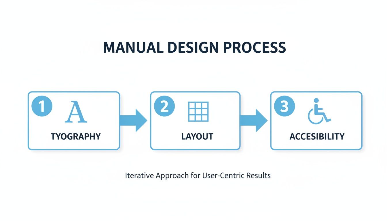
This visual is a great reminder of how foundational design choices directly impact the readability and usability of the final document you publish.
Secure Your Internal and Sensitive Documents
Not every user manual is meant for public consumption. You might be working on internal training guides, sensitive API documentation for partners, or early-access manuals for beta testers. In these cases, you absolutely need to control who sees your content.
With Hostmora, you can password-protect any published link with a single click. It’s a simple but incredibly effective layer of security, ensuring that only authorized people with the password can access sensitive information.
Publishing Methods Comparison
Let's break down the real-world difference between clinging to old habits and adopting a modern publishing workflow.
| Feature | Traditional Method (Email/PDF) | Hostmora Method (Live Link) |
|---|---|---|
| Updates & Corrections | Requires re-exporting, re-attaching, and re-sending a new file to everyone. Chaos ensues. | Update once, and the link is instantly current for all users. |
| Version Control | Multiple versions float around in inboxes and on hard drives. Nobody knows which is the latest. | One link is the single source of truth. Always. |
| Branding | The experience is generic, often buried in an email thread. | Use a custom domain (docs.yourcompany.com) for a professional, branded look. |
| Accessibility | Users are stuck with a static file. No easy way to add videos or interactive content. | Embed rich media, create an interactive experience, and connect to a digital world via QR codes. |
| Security | Once the file is sent, you have zero control over who sees or shares it. | Password-protect sensitive documents with a single click. |
The takeaway is clear: moving to a live-link model isn't just a minor improvement; it's a fundamental upgrade to how you manage and deliver documentation.
Make Your Manuals AI-Friendly
The way people find answers is changing fast. With over 25% of knowledge workers now regularly using AI tools like ChatGPT, Claude, and Gemini, your documentation needs to be ready. These AIs can read, understand, and synthesize information from public URLs, effectively turning your manual into a knowledge base users can "talk" to.
In fact, a recent survey found that 67% of technical evaluators considered easily searchable online documentation a high priority when making a purchase. When you publish with Hostmora, you’re not just putting a page on the web. You’re creating an AI-readable asset that makes your product’s knowledge more discoverable and useful than ever before.
Your Pre-Publication User Manual Checklist
We've walked through everything from big-picture strategy to the nitty-gritty of writing and design. Now, let's condense all that advice into a simple, practical checklist.
Think of this as your final quality assurance step before hitting "publish." A quick review here can mean the difference between a manual that empowers your users and one that just adds to your support team's workload.
Getting the Foundation Right
Before you even type a single word of the manual, your strategic plan needs to be rock-solid. I’ve seen teams rush this part, and the result is always a manual that completely misses the point.
- Who is this for? Do you have a crystal-clear picture of your user? What’s their technical comfort level? What are they actually trying to do with your product?
- What does success look like? Have you set clear, measurable goals? Think in terms of outcomes, like "A new user can set up their account and send their first message in under 10 minutes."
- Do you have all the intel? Have you gathered everything you need—engineering specs, a list of the most common questions from support tickets, and ideally, some direct feedback from actual users?
- Is the structure user-focused? Is your outline built around the user's journey (unpacking and setup, daily tasks, what to do when something goes wrong) instead of just being a boring list of product features?
A manual's success is determined long before the writing starts. If your foundation is weak, even the most beautifully written guide will crumble when a real user tries to follow it.
Nailing the Content and Design
Once your plan is set, it's all about execution. Your guiding stars here should be clarity, scannability, and making sure everyone can use it.
- Is the language simple? Go back and hunt down every bit of jargon. Have you used short, direct sentences that someone completely new to your product can understand without a dictionary?
- Are there enough visuals? A wall of text is intimidating. Break it up with helpful screenshots, simple diagrams, or even short video clips. Remember, good visuals can improve a user's ability to complete a task by as much as 67%.
- Can someone scan it easily? People rarely read manuals cover-to-cover. Use clear headings, short paragraphs, and a mix of numbered lists for steps and bullet points for tips. Make it easy to find an answer in 30 seconds.
- Is it accessible to everyone? Have you checked for high-contrast colors (the standard is a 4.5:1 ratio), added descriptive alt text to every image for screen readers, and ensured the content flows logically?
The Final Polish and Launch
The last mile is all about getting your polished manual to your users in a way that actually works for them.
- Has it been proofread? And I mean really proofread, by at least two different people. One person should check for spelling and grammar, and another should check for technical accuracy.
- Did a real user test it? Find someone who has never seen your product before. Hand them the manual and watch them work. Don’t help them! Their struggles are your most valuable feedback.
- How will you share it? Are you using a modern, flexible method? A live link from a service like Hostmora is a great option. It lets you push updates instantly, generate QR codes for physical products, and even add password protection if needed.
Your User Manual Questions, Answered
Even the best-laid plans hit a few bumps. When you're deep in the process of creating a manual, certain questions seem to come up again and again. I've been there. This is my quick-reference guide to help you navigate those common hurdles without losing momentum.
Let’s tackle some of the most frequent questions I hear from teams just like yours.
How Long Should a User Manual Be?
Forget about a magic number. A user manual should be exactly as long as it needs to be to solve a user's problem—and not a word longer.
Your goal is comprehensive clarity, not a specific page count. Focus on covering every essential task, all necessary safety warnings, and the most common troubleshooting scenarios. Cut the fluff.
For example, a smart plug might only need a one-page quick-start guide. Complex enterprise software, on the other hand, could require a full-blown online knowledge base. The real measure of success isn't length, but structure. A manual with a crystal-clear table of contents and a powerful search function lets users find what they need in seconds, no matter how big it is.
A great manual isn't judged by its length, but by how quickly a user can find their answer and get back to what they were doing. Brevity is a feature, but clarity is the ultimate goal.
What Is the Best Format for a User Manual?
The best format depends entirely on your user and where they'll be using your product.
In most cases today, a searchable, mobile-friendly online HTML version is the most powerful choice. Publishing through a service like Hostmora makes it instantly accessible on any device, easy to update without creating version-control chaos, and even readable by modern AI assistants.
Still, the classic PDF has its place, especially for users who need to work offline or print a hard copy. I've found a hybrid approach works wonders:
- Printed Quick-Start Guide: Tuck a small, simple card into the product packaging with the absolute essentials to get started.
- QR Code: Put a QR code on that card, linking directly to the full, comprehensive online manual.
This gives people the immediate satisfaction of a physical guide while guiding them to a much richer, always-up-to-date digital resource.
Do I Need To Be a Technical Writer To Create a Good Manual?
Absolutely not. While professional experience is a plus, the most important skills have nothing to do with a certification. What truly matters is empathy for your user, a commitment to simple language, and a logical, organized mind.
Think of yourself as a translator. Your job is to turn technical complexity into simple, actionable steps. Break down every process into small, easy-to-digest chunks.
Here's my go-to reality check: the "unfamiliar user test." Hand your draft to someone who knows nothing about your product and ask them to follow the instructions. If they can get the job done without asking you a single question, you've nailed it.
How Can I Make My User Manual More Engaging?
"Engaging documentation" might sound like a contradiction, but it's totally achievable. The trick is to focus on the visual experience and the tone of your writing.
- Lean on High-Quality Visuals: Use plenty of well-annotated screenshots, clean diagrams, and short video clips or GIFs (if it's an online manual). Good visuals can improve task completion rates by a staggering 67%.
- Embrace White Space: Don't cram everything together. A clean, uncluttered layout feels less intimidating and makes the content much easier to scan and absorb.
- Write Like a Human: Ditch the corporate jargon. Adopt a helpful, conversational tone, as if you're patiently explaining something to a friend.
- Use Smart Formatting: Guide the reader's eye. Use bold text for key terms, bullet points for lists, and numbered steps for sequences.
- Add Extra Value: Sprinkle in "Pro Tip" or "Good to Know" callouts. These break up the text and offer users genuinely useful shortcuts and insights they'll appreciate.
Ready to get your manual out there without the technical headaches? With Hostmora, you can turn your files into secure, globally-fast live links in seconds. Add custom domains, QR codes, and password protection with just a few clicks. Try Hostmora for free and see how simple professional publishing can be.